Grammar Studio launch brand refresh for the world's leading sports photography company, Offside – through a glorious visual language that will have football fans and photojournalist enthusiasts, pouring over their photography for hours.
Grammar Studio, a creative agency lead by Adam Gill and Pete O'Toole, which specialises in creative design, branding and digital work. They’ve worked for some of the biggest brands in the world, (recently relegated) premier league football teams, high-street retailers, corporate leaders, and local start-ups.
But it was their early work with Mundial Mag, where they got to know Offside a sports photography company - the world’s leading sports photography company - you could say. In a nutshell, through their website, you can license images from last night’s game (it’s updated multiple times a week), classic moments from events in sporting history, and photos from a massive archive that goes back over 100 years.
Offside have now reached that point in their own history, whereby the visual language of years of capturing special and intimate moments, needs to be bottled up and be made, undeniably, their own. A brand which speaks for 100 years of being on the sidelines of the game's most memorable moments.
Cult Kits sat down to speak with Grammar Studio to hear about the process for developing a visual language, which in some respects is long overdue.
_
Cult Kits: What is your relationship with Offside and how did the rebrand come about?
Adam Gill: We met Offside’s founder, photographer Mark Leech through our involvement with Mundial Magazine in its early days. We were part of the magazine’s conception and we worked on the early issues and some creative projects for Mundial in their early years. We were just in awe at some of the stories that Mark would tell us, about his experiences travelling to international tournaments, and the stories behind the photos that nobody really gets to know. Mark was floating this rebrand idea back then, but in the Autumn of last year we reconnected, and it was the right time to get the wheels in motion.

"Getting to rebrand a company as great as Offside and also knowing Mark for so long and 'what he's about' was a huge help. We are both huge football fans, so we already had ideas about what we could do."
CK: What was the process – tell us how you approached the rebrand?
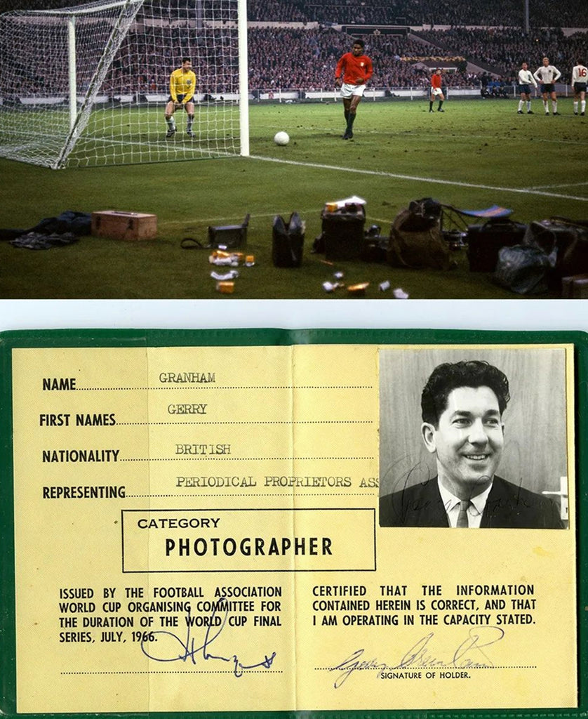
Pete O'Toole: We always knew Mark was up there with the very best. You can't buy his experience or knowledge of the game. Add to that, the Gerry Cranham archive and the UK rights to the L’Equipe archive, which Offside owns, and you have some serious sporting clout there. I mean, he has the original colour photos that Gerry took at the ’66 World Cup! So, we knew he had the product, it was our job to make Offside synonymous with the industry of sport photography
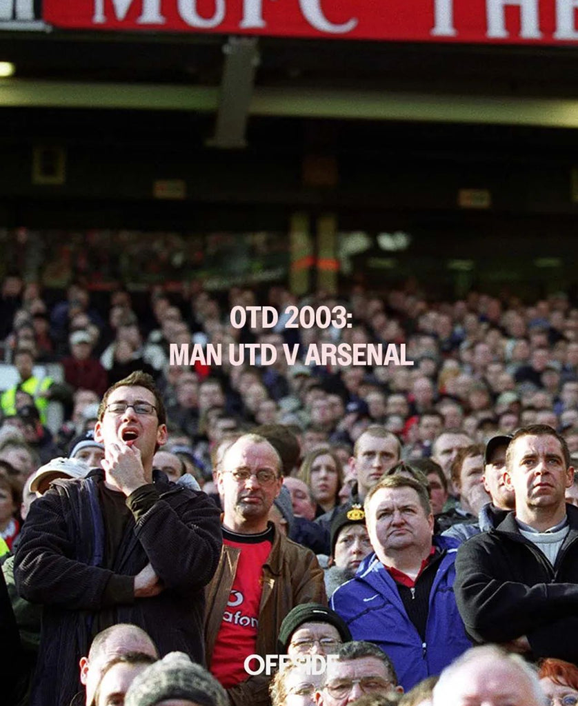
I felt from the start that more people should know about Mark and Offside, and this is something we are pushing. Mark is a very humble guy, but we want to celebrate his work and shout about it - and he was happy to oblige! Offside has a lot of amazing, candid moments of crowds and bystanders, and there's a very artistic framing to a lot of his photos and we wanted to really bring that to the forefront too, it's not just about the players on a pitch.

CK: Did you already have an idea of what the aesthetic for Offside could be?
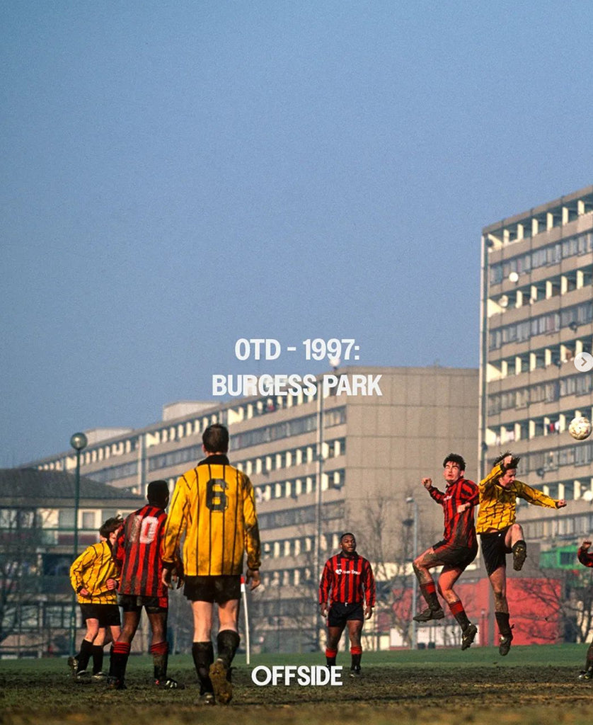
AG: Not an aesthetic as such, but I knew we would need to create a brand that can lean in both contemporary and heritage directions when required - just as Offside’s archive does. We also knew that we wanted to take a lead from the kind of branding you would see in a gallery or a museum, not a ‘sport brand’. I think we really nailed this part.

CK: Could you share what Offside's initial brief was?
AG: This whole project was a little different to a classic ‘client gives a brief’. We had a few good sit-downs with Mark and Charlotte about what the aim was, which is always the best way to figure out the what and the why. A uniformed, refreshed brand was always the starting point, but it became clear that going forward, the company’s messaging was just as important as anything aesthetic. We spent a lot of time working on how Offside can engage with industry and non-industry people, and strengthen their brand this way.

"Offside has a lot of amazing, candid moments of crowds and bystanders, and there's a very artistic framing to a lot of his photos and we wanted to really bring that to the forefront too, it's not just about the players on a pitch."
CK: What does the client think of the rebrand?
AG: Well, they said they were blown away by it after we presented our work, but I suppose we can’t really confirm this until the cheque clears, haha! We’ve given Offside the tools to show off their product, and this was a large part of their requirement. We know they’re happy with this.
Can you tell us what to expect from the new website – what can users expect from the site refresh?
AG: There’s definitely an If it ain’t broken, don’t fix it approach with the website. The new website will function in exactly the same way the current one does but with some helpful updates for users that bring it into 2024 and beyond. As well as a visual update we’ve also added more areas on the site to learn more about the company and its operations. Standard stuff!

CK: Offside is known for its rich history in sport photojournalism – what was it like to be given the task of rebranding them?
PO: It wasn't daunting for us at all. In fact, I would go as far as to say that it's a perfect project for Grammar, it's exactly the type of project we like to sink our teeth into. Getting to rebrand a company as great as Offside and also knowing Mark for so long and 'what he's about' was a huge help. We are both huge football fans, so we already had ideas about what we could do. If anything, I think we had to reign ourselves in a bit!

CK: How has the brand refresh been received?
PO: From what I've seen it has gone down really well. We decided to start rolling out the work slowly rather than shouting about it, and I think it has taken a few people by surprise. It's not completely rolled out yet but you can see how their social feeds are developing with the new look and soon the website will be live to match that aesthetic.
_
You can view more of Grammar Studio 's work here and view the archive on Offside here.


Leave a comment